Color Trend Forecast
I love doing this, mostly because I like finding out whether I am right on the flip side. The times I have tried doing so, I have been mostly right. Let`s see how well I do!
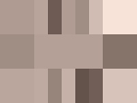
- Tan is in-To those of you who can`t see this lovely color, calibrate your darn monitors! (Sorry for the “darn” but this is a pet peeve of mine. If you cannot see it, it is your monitor`s fault.) For those of you who can feast your eyes on a color I feel is going to breakthrough web design and stationery. Though many people do not like this color (actually I only know one person) I like tan. Tans are really warm grays and they resemble natural textures which leads me to the next trend.
- No color, but texture-Between Kraft paper to lace, I would say this trend is singlehandedly the work of the scrappers (scrapbookers to you who may not know). Personally, Lace is not my cup of tea. But Kraft paper or any paper texture will do just fine. I have even seen sites that replicate the look of moleskine, a look I have a soft spot for. Here is an idea of what it looks like. Below is a sample of cork skin, another fun material

- Retro color is in-I don`t mean 70`s color palettes, I mean 50s-60s toy color palettes. To be fair this one has been in for a while. I believe this to be a direct trend set by the Toy Story Movies and the release of its latest installment. The combination that seems to making its way to commercials and packaging is this red and blue combo. Thought I have seen blue and hot pink and blue and chocolate, I would say this trend is here to stay well in to 2011. It`s very springy.

- Gold and Red-Though most people think of this colors as holiday colors, Red and gold or red and orangey-yellow is a great preppy color combo. Though both of these colors are very bright and high energy colors, I feel it`s important to say, these colors are the culinary equivalent of salt. Too much and you ruin your palette.


